Arewa Mobile Bottom Navigation Bar for WordPress
Professional WordPress Plugins

Table of Contents
Arewa Mobile Bottom Navigation Bar
**Arewa Mobile Bottom Navigation for WordPress** is a powerful, feature-rich WordPress plugin designed to enhance the mobile user experience of your website. This plugin adds a modern, floating bottom navigation bar that transforms your WordPress site into a mobile-first, app-like experience.
The plugin provides complete control over navigation appearance, functionality, and visibility, making it perfect for websites that prioritize mobile user experience. Whether you’re running an e-commerce store, a blog, a business website, or a portfolio, this plugin helps you create a professional mobile navigation system that your users will love.
What is This Plugin For?
This plugin is designed to:
– **Improve Mobile Navigation**: Replace traditional mobile menus with a modern bottom navigation bar that’s always accessible
– **Enhance User Experience**: Provide quick access to important pages and sections without scrolling
– **Create App-like Experience**: Give your WordPress site a native mobile app feel with floating navigation
– **Increase Engagement**: Make navigation more intuitive and accessible, potentially reducing bounce rates
– **Customize Navigation**: Fully customize the appearance, behavior, and visibility of your navigation bar
**Ideal for:**
– E-commerce websites
– Business websites
– Blog sites
– News websites
– Portfolio sites
– Any WordPress site wanting modern mobile navigation
Key Features
### Core Functionality
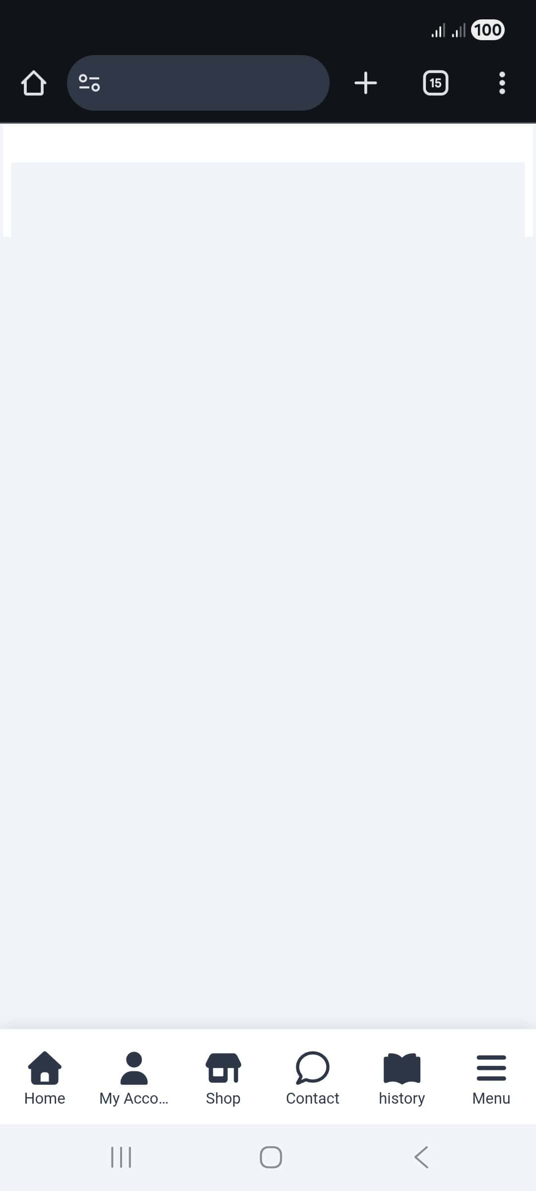
– **Floating Bottom Navigation Bar**: Always-visible navigation that stays at the bottom of the screen
– **Customizable Button Count**: Choose between 2 to 6 navigation buttons
– **Multiple Layout Styles**: Three different display modes for icons and text
– **Drag-and-Drop Reordering**: Easily rearrange buttons with intuitive drag-and-drop interface
– **Custom SVG Icons**: Use any SVG icon for each button with full color control
– **Submenu Support**: Create nested menus with unlimited submenu items
– **Advanced Visibility Controls**: Show or hide navigation based on pages, posts, categories, and more
### Design & Styling
– **Complete Color Customization**: Control colors for backgrounds, icons, text, and active states
– **Responsive Design**: Works perfectly on all device sizes
– **Smooth Animations**: Hover effects and pulse animations for active buttons
– **Box Shadow Control**: Customize shadow effects for depth
– **Border Radius**: Adjust corner rounding for modern design
– **Submenu Header**: Optional header with logo, site title, and description
### Visibility & Control
– **Multi-Mode Display**: Show on entire site, specific pages, posts, categories, or custom post types
– **Device-Specific Visibility**: Control visibility for mobile, tablet, or desktop devices
– **Conditional Display**: Combine multiple visibility rules for precise control
– **Admin Dashboard Control**: Option to hide navigation in WordPress admin area
– **Login Page Control**: Option to hide navigation on login/register pages
System Requirements
### Minimum Requirements
– **WordPress Version**: 5.0 or higher
– **PHP Version**: 7.2 or higher
– **Browser Support**: All modern browsers (Chrome, Firefox, Safari, Edge)
– **Device Support**: Mobile, tablet, and desktop devices
### Recommended Requirements
– **WordPress Version**: 6.0 or higher
– **PHP Version**: 7.4 or higher
– **Memory Limit**: 128MB or higher
– **Active Theme**: Any WordPress theme (compatible with all themes)
### Compatibility
– ✅ All WordPress themes
– ✅ Page builders (Elementor, Gutenberg, Beaver Builder, etc.)
– ✅ WooCommerce
– ✅ Multisite installations
– ✅ All major WordPress plugins
Installation Guide
Method 1: Automatic Installation (Recommended)
1. **Log in to WordPress Admin**
– Navigate to your WordPress admin dashboard
– Enter your administrator credentials
2. **Access Plugins Section**
– Click on **Plugins** in the left sidebar menu
– Click **Add New** at the top of the page
3. **Search for the Plugin**
– In the search box, type: **”Arewa Mobile Bottom Navigation”**
– Press Enter or click the search icon
4. **Install the Plugin**
– Click the **Install Now** button on the plugin card
– Wait for the installation to complete
5. **Activate the Plugin**
– Click the **Activate** button that appears after installation
– The plugin is now active and ready to use
### Method 2: Manual Installation
1. **Download the Plugin**
– Download the plugin ZIP file from the source
– Save it to your computer
2. **Access WordPress Admin**
– Log in to your WordPress admin dashboard
3. **Upload the Plugin**
– Go to **Plugins** → **Add New**
– Click **Upload Plugin** at the top
– Click **Choose File** and select the downloaded ZIP file
– Click **Install Now**
4. **Activate the Plugin**
– Click **Activate Plugin** after installation completes
### Post-Installation Setup
After installation, you’ll find a new menu item called **”Mobile Bottom”** in your WordPress admin sidebar. Click on it to access the plugin settings and start configuring your navigation bar.
Plugin Configuration
The plugin settings are organized into five main tabs for easy navigation. Each tab contains related settings that work together to create your perfect mobile navigation experience.
### General Settings Tab
The General Settings tab contains the fundamental configuration options for your navigation bar.
#### Enable / Disable
**Purpose**: Master switch to turn the entire navigation bar on or off.
**Options**:
– **Enable**: Activates the mobile bottom navigation bar on your website
– **Disable**: Completely deactivates the navigation bar (useful for maintenance or testing)
**When to Use**:
– Use **Enable** when you want the navigation to appear on your site
– Use **Disable** when you need to temporarily hide the navigation without losing your settings
**Note**: When disabled, all your configuration settings are preserved. Simply re-enable when ready.
#### Number of Buttons
**Purpose**: Determines how many navigation buttons appear in your bottom navigation bar.
**Options**: Choose between 2, 3, 4, 5, or 6 buttons
**Recommendations**:
– **2-3 buttons**: Best for simple sites with minimal navigation needs
– **4 buttons**: Ideal for most websites (balanced and professional)
– **5-6 buttons**: Suitable for complex sites with many important sections
**Best Practice**: Start with 4 buttons and adjust based on your site’s navigation needs. Too many buttons can make the navigation cluttered on small screens.
#### Layout Style

**Purpose**: Controls how icons and text are displayed in the navigation buttons.
**Options**:
1. **Icon Only**
– Shows only the icon for each button
– Best for: Minimalist designs, when space is limited, or when icons are very recognizable
– Pros: Clean, modern, saves space
– Cons: Less clear for users unfamiliar with your icons
2. **Icon + Text**
– Shows both icon and label text for all buttons
– Best for: Most websites, when clarity is important
– Pros: Clear and professional, works for all users
– Cons: Takes more vertical space
3. **Icon + Text on Active Button**
– Shows icon for all buttons, but text only appears on the active/selected button
– Best for: Modern app-like experience, when you want a clean look with contextual information
– Pros: Modern design, saves space while providing context
– Cons: Text only visible on active button
**Recommendation**: **Icon + Text** is the most user-friendly option for most websites, as it provides clear navigation without requiring users to guess what each icon represents.
Buttons Configuration Tab

This tab allows you to configure each individual navigation button. You can set up labels, icons, colors, URLs, and enable submenus for each button.
#### Button Setup
For each button, you can configure:
**Label**
– The text that appears below (or on) the icon
– Keep it short (1-2 words) for best results
– Examples: “Home”, “Shop”, “About”, “Contact”
**SVG Icon Code**
– Paste your SVG code directly into the text area
– The icon will be displayed in the navigation button
– Use `currentColor` in your SVG for the icon color to work properly
– You can find free SVG icons from sites like:
– Heroicons
– Font Awesome (SVG format)
– svgrepo.com (SVG format)
– Custom designed icons
**Icon Color**
– Sets the color of the SVG icon
– Works best when SVG uses `currentColor` or `fill=”currentColor”`
– Use hex codes (e.g., #333333) or color picker
**Text Color**
– Color of the button label text
– Should contrast well with the background for readability
**Background Color**
– Background color for the individual button
– Use “transparent” for no background
– Useful for creating visual distinction between buttons
**Active State Color**
– Color applied when the button is active (current page)
– Helps users identify their current location
– Should be distinct from the normal icon color
**URL**
– The link destination when the button is clicked
– Can be any page, post, or external URL
– Not required if submenu is enabled (button will open submenu instead)
**Link Target**
– **Same Tab**: Opens link in the current browser tab
– **New Tab**: Opens link in a new browser tab/window
– Use “New Tab” for external links or when you want users to stay on your site
**Has Submenu**
– **Enable**: Button opens a submenu instead of navigating to a URL
– **Disable**: Button navigates directly to the URL
– When enabled, configure submenu items in the “Submenus” tab
#### Drag-and-Drop Reordering
– Click and hold the handle (☰ icon) next to “Button X”
– Drag the button to your desired position
– Release to drop the button in the new position
– Buttons are automatically saved in the new order
**Tip**: Arrange buttons in order of importance, with the most frequently accessed pages first.

How to Use SVG Icons from SVGRepo
Step 1: Go to SVGRepo
Open your browser and visit svgrepo.com
Use the search bar to find the icon you want (for example: home, user, menu, etc.)
Step 2: Choose the Right Icon
Click on the icon you like
On the icon page:
Choose SVG as the format
Prefer Monochrome icons if available (they work best with color controls in WordPress)
Step 3: Download the SVG File
Click the Download SVG button
The file will be saved to your computer (for example:
home.svg)
Step 3: Upload the SVG to WordPress
⚠️ WordPress blocks SVG uploads by default.
If needed, install a plugin like “Safe SVG” or “SVG Support”.
Go to WordPress Dashboard → Media → Add New
Upload the downloaded
.svgfileOnce uploaded, click on the SVG in the Media Library
Step 4: Open the SVG URL and View Source (IMPORTANT)
This is the key step 👇
In the Media Library, copy the File URL of the SVG
Paste the URL into a new browser tab
The SVG will open as an image
Right-click anywhere on the page
Click “View Page Source” (or press
Ctrl + U/Cmd + Option + U)You will now see the full SVG code in the browser
Step 6: Copy the SVG Code
Select everything from
<svg>to</svg>

Copy it (Ctrl + C / Cmd + C)
Step 7: Paste the SVG Code into WordPress
Go to WordPress Admin Dashboard
Open Mobile Bottom Navigation
Go to Buttons Configuration
Paste the SVG code into the “SVG Icon Code” field
📌 Just like in your screenshot — paste the full <svg>...</svg> code.
Step 8: Set Icon Color and Save
Use Icon Color to choose the color
Click Save Changes
Refresh your website on mobile to see the icon
Submenus Configuration Tab

Submenus allow you to create nested navigation structures. When a user clicks a button with a submenu enabled, a slide-in overlay appears with additional navigation options.
#### Setting Up Submenus
**Prerequisites**:
– First, enable “Has Submenu” for a button in the Buttons tab
– Save your button settings
– Then configure submenu items in this tab
#### Submenu Items
For each submenu item, you can configure:
**Label**
– The text displayed for the submenu item
– Should be descriptive and clear
**SVG Icon Code**
– Icon for the submenu item
– Follows the same SVG guidelines as main buttons
**Icon Color**
– Color of the submenu item icon
– Can match or differ from main navigation colors
**URL**
– Destination when the submenu item is clicked
– Can link to any page, post, or external URL
**Link Target**
– Same Tab or New Tab option
– Choose based on your navigation strategy
#### Adding and Removing Items
– **Add Submenu Item**: Click the “Add Submenu Item” button to create a new item
– **Remove Item**: Click “Remove Item” on any submenu item to delete it
– You can add unlimited submenu items per button
**Best Practice**: Keep submenus organized with 5-10 items maximum for best user experience. Too many items can overwhelm users.
Styling & Appearance Tab

This tab contains all visual customization options for your navigation bar and submenus.
#### Navigation Bar Styling
**Background Color**
– Main background color of the navigation bar
– Choose a color that complements your site design
– White (#ffffff) is the default for a clean, professional look
**Border Radius (px)**
– Controls the rounded corners of the navigation bar
– Range: 0-50 pixels
– 0 = sharp corners (modern, minimal)
– Higher values = more rounded (softer, friendlier)
– Recommended: 0-10px for a subtle modern look
**Box Shadow**
– **Enable**: Adds a shadow effect below the navigation bar
– **Disable**: Removes the shadow for a flat design
– Shadows add depth and help the navigation stand out from content
– Recommended: Enable for better visibility
**Active Button Highlight Color**
– Color used to highlight the currently active button
– Helps users identify their current location
– Should contrast with normal button colors
– Default: #0073aa (WordPress blue)
**Hover Effects**
– **Enable**: Adds visual feedback when users hover over buttons
– **Disable**: Removes hover effects
– Hover effects improve user experience by providing visual feedback
– Recommended: Enable for better interactivity
**Active Button Pulse Animation**
– **Enable**: Shows a pulsing circular animation around the active button icon
– **Disable**: Removes the animation
– Adds a modern, dynamic feel to the navigation
– Recommended: Enable for a premium, app-like experience
#### Button Styling
**Button Text Size (px)**
– Font size for button labels
– Range: 8-20 pixels
– Default: 12px (readable and compact)
– Adjust based on your design preferences and screen size
**Button Icon Size (px)**
– Size of the button icons
– Range: 12-32 pixels
– Default: 20px (balanced and visible)
– Larger icons are more prominent but take more space
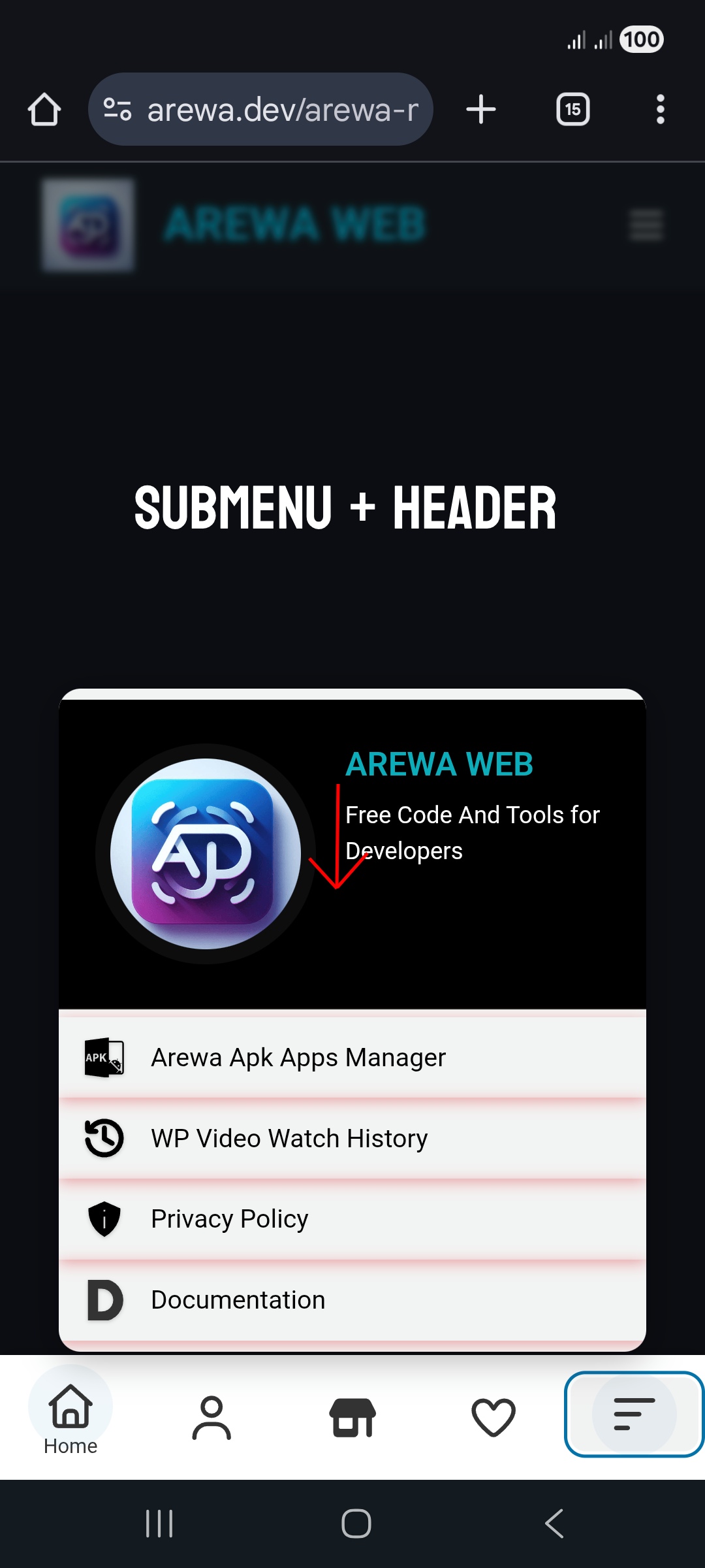
#### Submenu Header
The submenu header appears at the top of the submenu overlay and can include your logo, site title, and description.
**Enable Submenu Header**
– **Enable**: Shows header with logo and site information
– **Disable**: Hides the header for a minimal submenu
– Recommended: Enable for branding and professional appearance
**Site Logo**
– Upload your site logo or enter a logo URL
– Recommended size: 120×120 pixels for circular display
– Logo appears in a circular frame at the top of submenu
– Supports all common image formats (JPG, PNG, SVG)
**Logo Size (px)**
– Size of the circular logo display
– Range: 60-200 pixels
– Default: 120px
– Adjust to match your logo design
**Site Title**
– Text displayed below the logo
– Default: Your WordPress site name
– Can be customized to any text
– Appears prominently in the header
**Description**
– Short description text below the site title
– Maximum 150 characters
– Use for tagline, brief description, or call-to-action
– Optional but recommended for branding
**Header Background Color**
– Background color for the submenu header area
– Use “transparent” to blend with submenu background
– Can be customized to match your brand
**Site Title Color**
– Color of the site title text
– Should contrast with header background
– Default: White (#ffffff)
**Site Title Size (px)**
– Font size for the site title
– Range: 12-32 pixels
– Default: 18px
– Adjust for visual hierarchy
**Description Color**
– Color of the description text
– Default: Semi-transparent white (rgba(255, 255, 255, 0.7))
– Should be slightly lighter than title for hierarchy
**Description Size (px)**
– Font size for the description text
– Range: 10-20 pixels
– Default: 13px
– Should be smaller than title size
#### Submenu Styling
**Submenu Background Color**
– Background color of the submenu overlay
– Default: Dark (#1e1e28) for modern, app-like appearance
– Choose a color that provides good contrast with text
**Submenu Background Opacity**
– Transparency level of the submenu background
– Range: 0-100%
– 0% = fully transparent
– 100% = fully opaque
– Default: 95% (slightly transparent for depth)
– Lower opacity allows content behind to show through
**Submenu Shadow**
– **Enable**: Adds shadow effect to submenu overlay
– **Disable**: Removes shadow for flat design
– Shadows add depth and help submenu stand out
– Recommended: Enable
**Submenu Width (px)**
– Minimum width of the submenu overlay
– Range: 200-600 pixels
– Default: 320px (mobile-friendly)
– Adjust based on your content needs
**Submenu Text Color**
– Color of text in submenu items
– Should contrast well with submenu background
– Default: White (#ffffff)
**Icon Spacing (px)**
– Space between icon and text in submenu items
– Range: 0-30 pixels
– Default: 8px
– Adjust for visual balance
**Submenu Shadow Color**
– Color of the submenu shadow
– Default: Black (#000000)
– Can be customized to match your design
**Submenu Text Size (px)**
– Font size for submenu item labels
– Range: 10-20 pixels
– Default: 14px
– Should be readable and proportional
**Submenu Icon Size (px)**
– Size of icons in submenu items
– Range: 16-32 pixels
– Default: 22px
– Slightly larger than main button icons for visibility
Visibility Conditions Tab
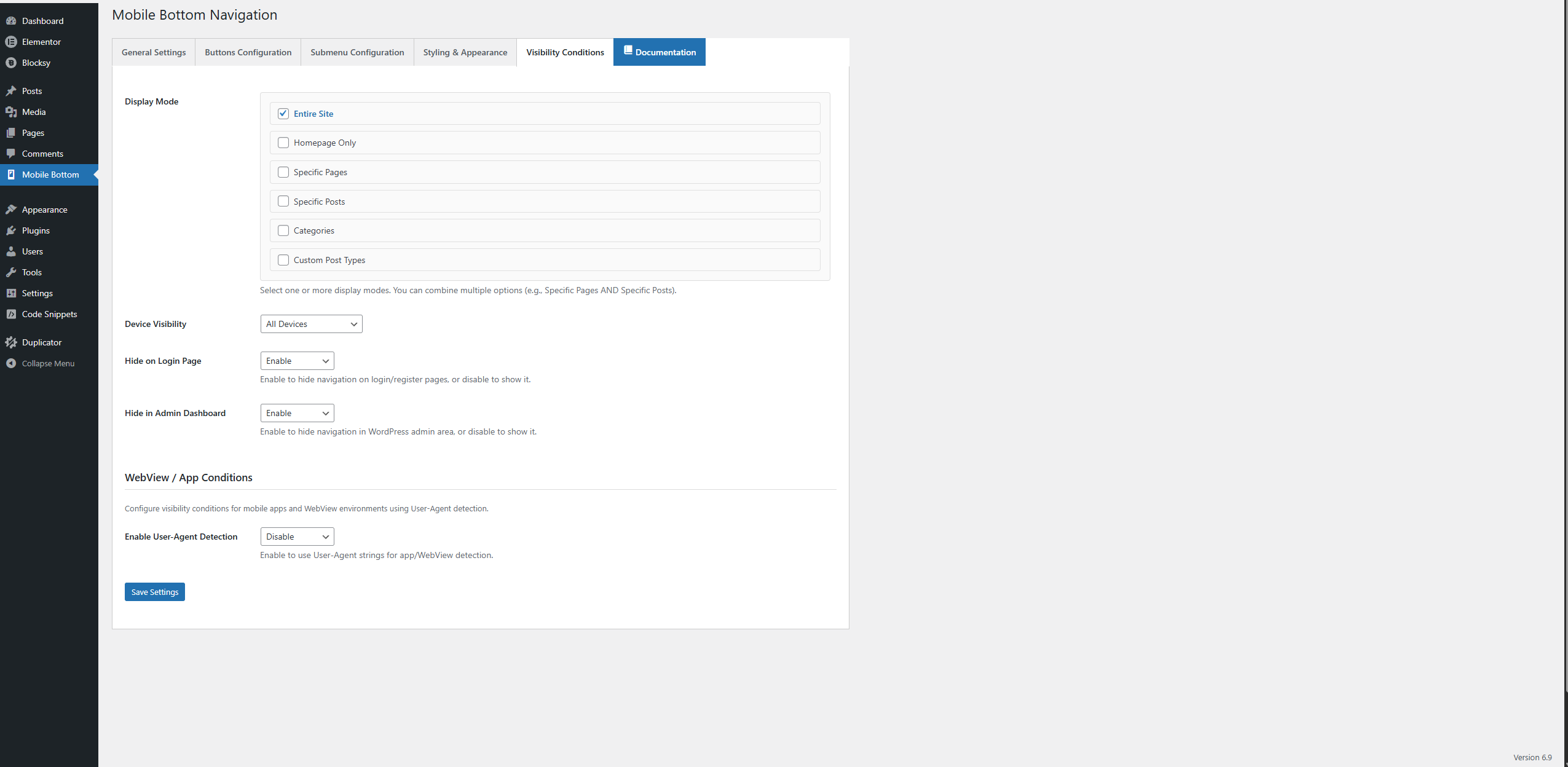
### Visibility Conditions Tab
This tab controls where and when your navigation bar appears on your website. You can create complex visibility rules to show the navigation exactly where you need it.
#### Display Mode
The Display Mode allows you to select one or more conditions for when the navigation should appear. You can combine multiple modes (e.g., show on specific pages AND specific posts).
**Options**:
1. **Entire Site**
– Shows navigation on all pages of your website
– Simplest option, good for most websites
– When selected alone, navigation appears everywhere
2. **Homepage Only**
– Shows navigation only on the homepage
– Useful when you want navigation only on the main landing page
3. **Specific Pages**
– Shows navigation only on selected pages
– When selected, a page selection interface appears
– Use the search box to find pages quickly
– Select multiple pages using checkboxes
– Use “Select All” or “Deselect All” for bulk operations
4. **Specific Posts**
– Shows navigation only on selected blog posts
– When selected, a post selection interface appears
– Search and select posts individually or in bulk
– Useful for highlighting navigation on important articles
5. **Categories**
– Shows navigation on all posts/pages within selected categories
– When selected, a category selection interface appears
– Select one or more categories
– Navigation appears on category archive pages and all posts in those categories
– Great for category-specific navigation
6. **Custom Post Types**
– Shows navigation on selected custom post types
– When selected, a post type selection interface appears
– Useful for WooCommerce products, portfolio items, etc.
– Select post types that should show navigation
**Combining Modes**: You can select multiple display modes simultaneously. For example:
– Select “Specific Pages” AND “Specific Posts” to show navigation on both
– Select “Categories” AND “Custom Post Types” for combined visibility
– The navigation appears if ANY selected condition is met (OR logic)
**Best Practice**: Start with “Entire Site” for simplicity. As you become more familiar with the plugin, use specific modes for targeted navigation placement.
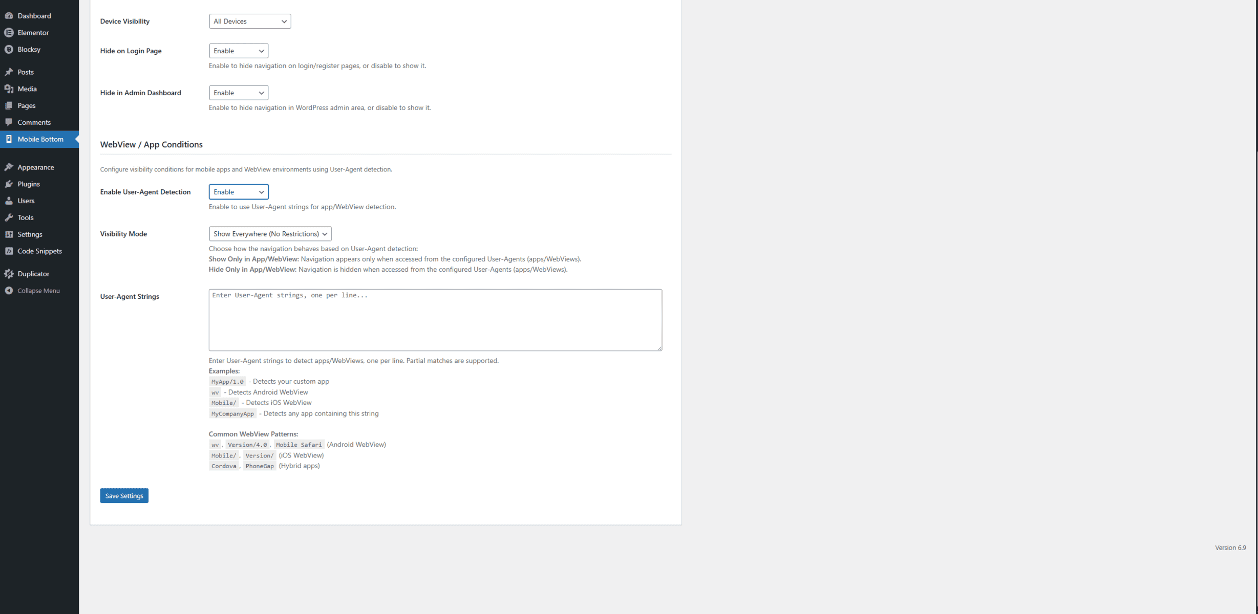
#### Device Visibility
Controls which devices should display the navigation bar.
**Options**:
– **All Devices**: Navigation appears on mobile, tablet, and desktop
– **Mobile & Tablet Only**: Navigation appears only on mobile phones and tablets (not desktop)
– **Mobile Only**: Navigation appears only on mobile phones
– **Tablet Only**: Navigation appears only on tablets
– **Desktop Only**: Navigation appears only on desktop computers
**Recommendation**: For a mobile bottom navigation, **”Mobile & Tablet Only”** is typically the best choice, as desktop users usually have traditional navigation menus. However, you can enable it on all devices if you prefer a consistent experience.
#### Hide on Login Page
**Purpose**: Controls whether the navigation appears on WordPress login and registration pages.
**Options**:
– **Enable**: Hides navigation on login/register pages (recommended)
– **Disable**: Shows navigation on login/register pages
**Recommendation**: Enable this option, as navigation is typically not needed on login pages and can interfere with the login experience.
#### Hide in Admin Dashboard
**Purpose**: Controls whether the navigation appears in the WordPress admin area.
**Options**:
– **Enable**: Hides navigation in admin dashboard (recommended)
– **Disable**: Shows navigation in admin dashboard
**Recommendation**: Enable this option. The navigation is designed for frontend users, not administrators. Showing it in the admin area can be distracting and unnecessary.
#### WebView / App Conditions (NEW!)
The plugin now includes advanced User-Agent detection capabilities, allowing you to control navigation visibility specifically for mobile apps and WebView environments. This is perfect for websites that have companion mobile apps or want different navigation behavior in app contexts.
**Enable User-Agent Detection**
**Purpose**: Master switch to activate User-Agent based visibility controls.
**Options**:
– **Enable**: Activates User-Agent detection and visibility controls
– **Disable**: Disables User-Agent detection (navigation behaves normally)
**When to Use**: Enable when you have a mobile app or want to control navigation visibility based on the user’s browser/app environment.
**Visibility Mode**
**Purpose**: Determines how the navigation behaves when User-Agent detection is enabled.
**Options**:
1. **Show Everywhere (No Restrictions)**
– Default behavior, navigation appears regardless of User-Agent
– Use when you want consistent navigation across all environments
– Good for testing or when you don’t need app-specific behavior
2. **Show Only in App/WebView**
– Navigation appears ONLY when accessed from configured User-Agents
– Perfect for websites with companion mobile apps
– Navigation is hidden in regular browsers, visible only in your app
– Use case: App-exclusive navigation features
3. **Hide Only in App/WebView**
– Navigation is HIDDEN when accessed from configured User-Agents
– Navigation appears in regular browsers but not in your app
– Use case: When your app has its own navigation and you don’t want duplicate navigation
**User-Agent Strings**
**Purpose**: Define which User-Agent strings should trigger the visibility rules.
**Configuration**:
– Enter User-Agent strings one per line in the text area
– Partial matching is supported (case-insensitive)
– Multiple User-Agents can be configured for different apps
**Common User-Agent Examples**:
*Android WebView Detection:*
“`
wv
Version/4.0
Mobile Safari
“`
*iOS WebView Detection:*
“`
Mobile/
Version/
“`
*Custom App Detection:*
“`
MyApp/1.0
MyCompanyApp
WebViewWrapper
MobileAppName
“`
*Hybrid App Frameworks:*
“`
Cordova
PhoneGap
Ionic
“`
Best Practices
### Design Recommendations
1. **Keep It Simple**
– Limit to 4-5 buttons for optimal usability
– Use clear, recognizable icons
– Keep labels short and descriptive
2. **Color Coordination**
– Match navigation colors to your site’s color scheme
– Ensure sufficient contrast for readability
– Use active state colors to clearly indicate current page
3. **Icon Selection**
– Choose icons that are universally understood
– Test icons with users if possible
– Ensure icons are scalable and clear at small sizes
– Use consistent icon style throughout
4. **Mobile-First Approach**
– Design primarily for mobile devices
– Test on actual mobile devices, not just desktop browsers
– Ensure touch targets are large enough (minimum 44x44px)
### Content Organization
1. **Button Priority**
– Place most important pages first (left to right)
– Home button is typically first
– Contact or important action buttons can be last
2. **Submenu Structure**
– Limit submenu items to 5-10 for best usability
– Group related items together
– Use clear, descriptive labels
3. **URL Strategy**
– Use clean, SEO-friendly URLs
– Consider using “New Tab” for external links
– Test all links after configuration
### Performance
1. **Icon Optimization**
– Use optimized SVG icons (remove unnecessary code)
– Keep SVG code clean and minimal
– Avoid overly complex SVG paths
2. **Visibility Rules**
– Use specific visibility rules to avoid unnecessary loading
– Don’t show navigation where it’s not needed
– Test visibility rules on different pages
### User Experience
1. **Consistency**
– Keep navigation consistent across your site
– Use the same icons and labels throughout
– Maintain consistent styling
2. **Accessibility**
– Ensure sufficient color contrast
– Use descriptive labels (not just icons)
– Test with screen readers if possible
3. **Testing**
– Test on multiple devices and browsers
– Test all navigation links
– Verify submenus work correctly
– Check visibility rules on different pages
Common Use Cases
### E-Commerce Websites
**Setup**:
– 4-5 buttons: Home, Shop, Categories, Cart, Account
– Enable submenu on “Categories” with product categories
– Use shopping cart icon for cart button
– Set visibility to “Entire Site” or “Specific Pages” (product pages, shop pages)
**Styling**:
– Match brand colors
– Use prominent active state color
– Enable pulse animation for active button
### Business Websites
**Setup**:
– 4 buttons: Home, About, Services, Contact
– Enable submenu on “Services” with service offerings
– Use professional, business-appropriate icons
– Show on all pages for consistent navigation
**Styling**:
– Professional color scheme
– Clean, minimal design
– Enable submenu header with company logo
### Blog Sites
**Setup**:
– 4-5 buttons: Home, Blog, Categories, About, Contact
– Enable submenu on “Categories” with blog categories
– Use visibility rules to show on blog posts and category pages
– Consider showing only on mobile devices
**Styling**:
– Match blog theme colors
– Use readable text sizes
– Enable hover effects for better interactivity
### News Websites
**Setup**:
– 5-6 buttons: Home, News, Categories, Videos, About, Contact
– Enable submenus for categories and sections
– Use visibility to show on article pages and category archives
– Mobile and tablet only visibility
**Styling**:
– News-appropriate color scheme
– Clear, readable typography
– Prominent active state indicators
### Portfolio Sites
**Setup**:
– 4 buttons: Home, Portfolio, About, Contact
– Enable submenu on “Portfolio” with portfolio categories
– Show on portfolio pages and project pages
– Use creative, portfolio-appropriate icons
**Styling**:
– Match portfolio design aesthetic
– Creative use of colors
– Enable animations for modern feel
Frequently Asked Questions (FAQ)
General Questions
Does this plugin work with all WordPress themes?
Yes, the plugin is designed to work with any WordPress theme. It uses standard WordPress hooks and doesn't interfere with theme functionality.
Will this plugin slow down my website?
No, the plugin is lightweight and optimized for performance. It only loads necessary assets when the navigation is enabled and should be displayed.
Can I use this plugin on desktop as well as mobile?
Yes, you can configure device visibility to show the navigation on all devices, or limit it to mobile and tablet only. The choice is yours.
What happens to my settings if I deactivate the plugin?
All your settings are preserved when you deactivate the plugin. When you reactivate it, all your configuration will be restored automatically.
Can I have different navigation configurations for different pages?
The plugin supports one navigation configuration at a time, but you can use visibility rules to show or hide the navigation on specific pages, posts, or categories.
Configuration Questions
How many buttons can I add?
You can add between 2 and 6 navigation buttons. We recommend 4 buttons for most websites as it provides a good balance between functionality and usability.
Can I use my own custom icons?
Yes, you can use any SVG icon. Simply paste the SVG code into the icon field for each button. Make sure your SVG uses currentColor for the color to work properly.
What's the difference between the three layout styles?
- Icon Only: Shows just icons (minimal, modern)
- Icon + Text: Shows icons and labels for all buttons (clearest, most user-friendly)
- Icon + Text on Active: Shows icons for all, text only on active button (modern app-like)
Can I change the order of buttons?
Yes, you can drag and drop buttons to reorder them. Click and hold the handle (☰) next to a button and drag it to the desired position.
How do submenus work?
When you enable "Has Submenu" for a button, clicking that button opens a slide-in overlay with additional navigation options. Configure submenu items in the "Submenus" tab.
Styling Questions
Can I match the navigation colors to my theme?
Yes, you have complete control over all colors including backgrounds, icons, text, and active states. Use the color pickers to match your theme exactly.
What's the best background color for the navigation bar?
This depends on your site design. White (#ffffff) is popular for a clean look, but you can use any color that complements your theme. Ensure sufficient contrast for readability.
Should I enable the pulse animation?
The pulse animation adds a modern, app-like feel to the navigation. We recommend enabling it for a premium user experience, but you can disable it if you prefer a more static design.
Can I customize the submenu appearance?
Yes, you have extensive control over submenu styling including background color, opacity, text colors, icon sizes, and spacing. You can also add a header with your logo and site information.
Visibility Questions
Can I show the navigation only on specific pages?
Yes, use the "Specific Pages" display mode and select the pages where you want the navigation to appear. You can also combine this with other display modes.
How do I show navigation on blog posts in specific categories?
Select "Categories" in the Display Mode, then choose the categories where you want the navigation to appear. The navigation will show on category archive pages and all posts in those categories.
Can I hide the navigation on certain pages?
Yes, use the visibility conditions to show navigation only where you want it. If you don't select a page in "Specific Pages," the navigation won't appear there unless other conditions are met.
Should I show navigation on desktop?
This depends on your preference. Most websites use bottom navigation primarily for mobile devices. However, you can enable it on all devices for a consistent experience.
Technical Questions
Does this plugin require coding knowledge?
No, the plugin is designed for users without coding knowledge. All configuration is done through an intuitive admin interface. However, basic knowledge of SVG icons can be helpful.
Can developers customize this plugin further?
Yes, the plugin follows WordPress coding standards and uses standard hooks. Developers can extend functionality using WordPress filters and actions.
Is this plugin compatible with page builders?
Yes, the plugin works with all major page builders including Elementor, Gutenberg, Beaver Builder, and others.
Does the plugin work with WooCommerce?
Yes, the plugin is fully compatible with WooCommerce. You can use it to navigate to shop pages, product pages, cart, and account pages.
Can I export/import my settings?
Currently, settings are stored in WordPress options. You can use WordPress export/import tools or backup plugins to preserve your configuration.
Support and Contact
## Support and Contact
### Getting Help
If you need assistance with the plugin, we’re here to help! Here are the best ways to get support:
**Documentation**
– Visit our complete documentation at: https://arewa.dev/arewa-mobile-bottom-navigation-bar/
– Check the FAQ section above for common questions
– Review the configuration guides in this documentation
**Support Channels**
– **Website**: https://arewa.dev/
– **Plugin Page**: https://arewa.dev/arewa-mobile-bottom-navigation-bar/
– **Email**: Contact us through our website contact form
### Reporting Issues
If you encounter any issues or bugs:
1. **Check the FAQ**: Many common issues are addressed in the FAQ section
2. **Review Settings**: Ensure all settings are configured correctly
3. **Test in Different Browsers**: Some issues may be browser-specific
4. **Contact Support**: Reach out to us with:
– Description of the issue
– Steps to reproduce
– Your WordPress version
– PHP version
– Browser and device information
### Feature Requests
We value your feedback! If you have suggestions for new features or improvements:
– Contact us through our website
– Describe the feature and how it would benefit users
– We consider all suggestions for future updates
### Updates and Maintenance
**Staying Updated**
– The plugin receives regular updates for compatibility and new features
– Update notifications appear in your WordPress admin dashboard
– Always backup your site before updating plugins
**Changelog**
== Changelog ==
= 1.3.3 =
* FIXED: Cache conflict causing mobile bottom navigation to disappear after a few hours
* IMPROVED: Vary: User-Agent header now sent when device visibility is mobile/tablet (prevents wrong cached version)
* IMPROVED: Full-page cache purge on settings update (LiteSpeed, WP Rocket, W3TC, and more)
* IMPROVED: Visibility cache versioning for proper invalidation when settings change
* Code: Refactored third-party cache hooks to comply with WordPress.org naming conventions
= 1.3.1 =
* Security: Improved sanitization, validation, and escaping to fully align with WordPress.org guidelines
* Security: Proper nonce verification and capability checks added to all save handlers
* Security: SVG output restricted via wp_kses; all dynamic output properly escaped
* Code: Removed all phpcs:ignore directives and reviewed for WordPress Coding Standards compliance
* Code: Moved new-button HTML template to PHP via wp_localize_script to resolve admin.js lint issues
* Code: Updated Contributors list (arewadev) and adjusted visibility validation logic
= 1.3.0 – 2026-02-09 =
* IMPROVED: Better color picker initialization for dynamic fields
* FIXED: Color picker compatibility issues with WordPress admin
* FIXED: Critical error with duplicate wp_localize_script calls
* FIXED: Color values not displaying correctly in admin panel
* UPDATED: All color fields now use modern Pickr color picker
* UPDATED: Color values stored as RGBA for better transparency support
= 1.2.0 =
* **NEW: WebView/App Detection** – Control navigation visibility within mobile apps using User-Agent detection
* **NEW: Advanced Cache Management** – Smart caching system prevents visibility issues and ensures consistent behavior
* **NEW: User-Agent Configuration** – Define custom User-Agent strings to detect specific apps or WebViews
* **NEW: Flexible Visibility Modes** – Show only in apps, hide only in apps, or show everywhere
* **NEW: Cache-Busting Headers** – Adds Vary: User-Agent header to prevent caching conflicts
* **IMPROVED: Performance** – Optimized visibility checks with intelligent caching
* **IMPROVED: Admin Interface** – Enhanced visibility conditions section with WebView settings
* **FIXED: Cache Issues** – Resolved problems where visibility conditions weren’t applied consistently
* **FIXED: Settings Persistence** – Improved settings saving and validation
* Security enhancements and code optimization
= 1.1.1 =
* Enhanced visibility controls with multi-select display modes
* Improved dropdown selection interface with Select2
* Fixed settings save functionality for all select fields
* Added documentation button in admin interface
* Updated plugin metadata (Author, Plugin URI, Text Domain)
* Improved default values (all options default to Enable)
* Better error handling and validation
* Performance optimizations
= 1.1.0 =
* Added submenu header with logo support
* Enhanced visibility conditions
* Improved admin interface
* Better mobile responsiveness
* Bug fixes and improvements
= 1.0.0 =
* Initial release
* Basic navigation functionality
* Button configuration
* Styling options
—
## Conclusion
**Arewa Mobile Bottom Navigation for WordPress** is a powerful tool for enhancing your website’s mobile user experience. With its extensive customization options, intuitive interface, and flexible visibility controls, you can create a navigation system that perfectly matches your site’s needs.
Whether you’re running an e-commerce store, a blog, a business website, or any other type of WordPress site, this plugin helps you provide a modern, app-like navigation experience that your users will appreciate.
Remember to:
– Start with simple configurations and expand as needed
– Test your navigation on actual mobile devices
– Keep your navigation organized and user-friendly
– Match your navigation design to your site’s aesthetic
– Use visibility rules to show navigation where it’s most useful
Thank you for using Arewa Mobile Bottom Navigation for WordPress! We hope this documentation helps you get the most out of the plugin.
—
**Plugin Version**: 1.3.1
**Last Updated**: February 2026
**Documentation Version**: 1.1